The Lived-In Room Myth: More Props Do Not Make Better Design
Screen rooms feel lived in through purposeful selection and placement, not clutter. Learn to read which objects support character, story and visual clarity.
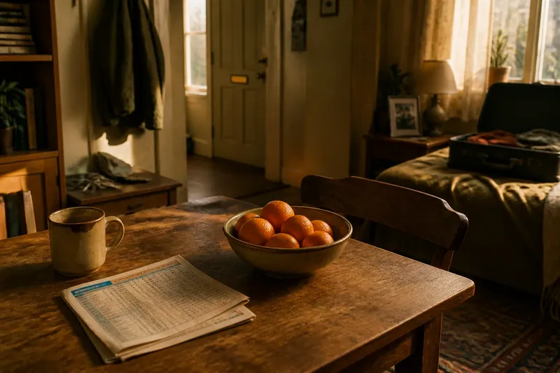
A kitchen table holds a chipped mug, a folded bus timetable and a bowl of oranges. In the next shot, the same table is crowded with jars, receipts, a newspaper, spare keys and a decorative plant. The second version has more objects, but it may tell us less. In screen design, a lived-in room is not simply a room with plenty of props; its objects need to belong to the people and action we see there.
That distinction helps viewers read a scene. A prop is an object selected for use or meaning within the frame; set dressing fills out the surroundings, often without being handled. Both can make a place feel specific, but neither becomes useful through quantity alone. The better question is what the room needs to communicate, and which objects can do that work without competing with one another.
Start with the scene’s need
Before deciding whether a room looks too bare, ask what the scene asks you to notice. A character may be searching for a letter, avoiding a family photograph or trying to make a meal while someone talks. Objects matter differently in each case. The letter must be legible or findable; the photograph may register in the background; the cookware can make the task credible without turning the kitchen into a catalogue.
Think of design as a sequence of choices rather than a count of things. A few selected objects can suggest a routine, a relationship or a disruption. More objects may add texture, but if they draw attention away from the scene’s central action, their detail works against the design.
Look first at what the characters touch, avoid or notice. Then consider what the background quietly supports.
Choose by viewing situation
Different scenes call for different kinds of evidence. Use the situation below that most resembles what you are watching; the same room can need a different design choice from one scene to the next.
If the room feels generic
Look for a small number of objects that imply particular habits rather than a general idea of “home”. A marked-up recipe card beside a mixing bowl suggests repeated cooking more precisely than a large assortment of generic kitchen accessories. The detail should fit the character’s circumstances and the scene, not merely signal that somebody has lived there.
This is the right approach when the setting could otherwise belong to anyone. Specific objects give a room character without requiring every surface to be occupied.
If the action is hard to follow
Give priority to objects the scene uses. If a character must find a key, the audience needs a fair visual chance to register where it is; an unrelated cluster nearby can obscure that information. Background dressing should not make the important action harder to read.
This choice fits scenes built around searching, handling or passing an object between people. Clear placement gives the action a visual path.
If a room feels too tidy
Look for signs of routine or interruption, not a blanket layer of disorder. A chair pulled away from the table, a half-finished cup or a coat resting on the back of a seat can imply recent activity. The object’s position matters: a coat carefully hung suggests a different habit from one dropped where its owner stopped.
Choose this approach when a spotless room seems emotionally or practically implausible. One meaningful trace can do more than scattered clutter.
If the room competes with the people
Reduce or quiet the details that pull the eye away from faces, movement or important objects. A bright patterned cushion or a crowded shelf may become visually dominant even if neither matters to the scene. A plainer background can let performance and action carry the moment.
This fits intimate scenes where attention needs to remain on small changes in expression or behaviour. Design can support focus by withholding detail.
Placement makes meaning
An object’s position is part of its character. A stack of mail on a hallway table suggests a routine only if it looks as though someone might actually leave mail there. A glass beside a sink belongs to a different pattern of use from the same glass centred on a polished coffee table. Viewers infer habits from relationships between objects and surfaces, not from isolated props alone.
Placement also creates a visual hierarchy: the arrangement of elements that tells the eye what matters first, next and last. A scene’s focal object may sit in clear view, while less important details remain subdued. The balance can change as a character moves, but the room should not make every item demand equal attention.
Imagine a scene in which a tenant is deciding whether to leave. The room has a suitcase open on the bed, a framed photograph still on the bedside table and a key beside the door. If the key is tucked among a busy collection of unrelated objects, the decision may be harder to read. Placing it alone near the exit creates a clear visual cue, while the untouched photograph can quietly suggest what is difficult to leave behind. The meaning comes from selection and relation, not from filling every shelf.
Use age and wear selectively
Wear can make an object feel handled, but wear needs a reason. A worn armrest on a favourite chair implies repeated use; a pristine table beside it may indicate that the furniture is newer or less central to daily life. If every surface is scratched, stained or faded, those differences disappear. A room can look artificially distressed when all its objects seem to carry the same history.
Consider what a person would maintain, replace or ignore. A carefully repaired kettle might reveal a habit of making do, while a clean, unused appliance could suggest a room arranged for show. These clues are most convincing when they agree with the character and the scene rather than arriving as decoration without context.
When a detail feels conspicuously worn, ask whose use could have made it so.
Read colour and texture
Objects contribute to the scene’s overall visual pattern. A vivid red cushion may stand out against muted furniture; a collection of glass jars can create repeated highlights. That pattern can help establish mood or guide attention, but it may also compete with a character’s clothing or a prop central to the action.
Texture works similarly. Rough fabric, glossy paint, paper and metal catch light in different ways. A room can feel varied without being crowded if its materials contrast thoughtfully. Conversely, many objects with similar shapes or bright surfaces may merge into visual noise.
For viewers, a useful test is to notice what remains memorable after the scene: a particular object, an arrangement, or simply a busy background. If the room’s details are difficult to separate, the design may be offering more information than the moment can use.
When does more dressing help?
Can clutter make a room believable?
Yes, when it reflects an identifiable pattern of use or supports the scene’s action. Clutter without a clear relationship to the character can look like decoration arranged to imitate mess.
Why do some sparse rooms feel lived in?
A sparse room can still show routine through placement, wear and a few personally meaningful objects. The viewer reads how those things are used, not just how many are present.
Should every prop have a story?
Not every object needs a hidden meaning or plot function. It should, however, fit the room’s visual and practical logic rather than distract without adding anything the scene needs.
How can I tell if a prop is important?
Notice whether the camera, a character’s behaviour or the scene’s action gives it special attention. If it repeatedly draws your eye but seems unrelated to the moment, it may be competing with stronger visual information.
Make the distinction
When a screen room feels convincing, it is tempting to credit its apparent abundance. Look more closely at what the objects are doing. A mug may establish a habit, a chair may show where someone sits, and a bare patch on a crowded surface may make an absence visible. Other details simply establish texture, and some are designed to stay unnoticed.
That is why the lived-in room myth is so persistent: viewers often remember the atmosphere, not the selection that produced it. The phrase lived-in room is useful when it points to credible patterns of use, but misleading if it becomes a reason to add objects indiscriminately. A carefully chosen detail can make a room feel inhabited; an unnecessary one can make it feel staged.
On your next watch, pick one corner of the frame and trace its objects back to a possible habit, action or visual cue. If you cannot find a connection, the detail may still serve the room’s texture—but you will know the difference between purposeful abundance and mere accumulation.